-
Architects: Shigeru Ban Architects
- Area: 11330 m²
- Year: 2010
-
Photographs:Didier Boy De La Tour
-
Manufacturers: Alucobond
-
Acoustics: Commins Acoustics workshop, Daniel Commins
-
Lighting: L’Observatoire 1, Icon, Geroges Berne, Anthony Perrot, Remy Cimadevilla, Akari-Lisa Ishii
-
MEP: Ove Arup & Partners, GEC Ingénierie, Philippe Vivier, René Andrian, Emmanuelle Danisi, Florence Collier, James Whelan, Chris Moore
-
Timber Roof Structural Analysis: SJB, Franz Tshuemperlin, Samuel Keller
Text description provided by the architects. My first thoughts when beginning the design were two recent phenomena concerning art museums throughout the world today. The first trend, which has become widely known as the “Bilbao Effect”, was born from the Guggenheim Museum in Bilbao, Spain, designed by Frank O. Gehry and completed in 1998. The strategy was to create sculptural architecture in an internationally unknown city to draw tourism, and it was ultimately a success. But there is an opinion that this kind of architecture spoils its functionality by disregarding the concerns of artists and staff, to produce a personal monument resulting in poor conditions for displaying and viewing art.
As an example at the other extreme, there is a method of renovating old industrial architecture to produce an optimal space for the exhibition of works, however neutral the architecture may be. The Tate Modern in London, and the Dia:Beacon completed in 2003 in upstate New York for the Dia Art Foundation are such successful examples. Rather than choosing either extreme, I thought to create a design concept which considered the ease of displaying and viewing art, while architecturally leaving a deep impression with visitors.
In order to create functional spaces, I articulated the program into simple volumes with a clear circulation amongst them. They were arranged three-dimensionally, in order to simplify their functional interrelationship.
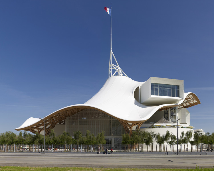
The general galleries with varying requirements for lengths were based on a 15m wide module to create three simple square tubes with long, 90m deep rectangular volumes inside. The three tubes are stacked vertically and arranged around a hexagonal steel frame tower which contains the stairs and elevators. The space created beneath the tiered ceilings of the three shifted Gallery Tubes make up the Grand Nef Gallery.
The main purpose for this annex to the Centre Pompidou was to be able to show more works to the public (only about 20% of the entire collection is exhibited in Paris), and to be able to display the very large works that cannot be shown in the Paris museum due to the 5.5m ceiling height under the beams. To accommodate this requirement, 18m was maintained as the highest ceiling height under the Grand Nef Gallery.
The site is the location of the original switchyard south of the current station, and is isolated from the urban center of the city to the north. To establish contextual continuation with the city, the large picture windows at the ends of the three gallery tubes frame views to the city’s monuments. Through this design, the building and the city become one. The picture window of the uppermost Gallery Tube 3 frames the view to the cathedral, the symbol of Metz, and Gallery Tube 2 frames the central station. Owing to Metz’s proximity to the German border and the many wars of the past, the city has changed hands between France and Germany on several occasions. This station is thus an important part of the city’s history, a monument in the neo-Romanesque style during a period when Metz was under German occupation.
Aside from the three Gallery Tubes, there is a round volume containing the Creation Studio with a restaurant on top, and a square-shaped volume containing an auditorium, offices, and other back of house program spaces. A timber roof structure in the form of a hexagon hovers over all of the separate volumes in order to unify them into a cohesive whole. To the French, the hexagon is a symbol of their country, as it is similar to the geographical shape of France. Furthermore, the hexagonal is composed of a pattern of hexagons and equilateral triangles inspired by traditional woven bamboo hats and baskets of Asia. Although it is preferred to form triangles to create in-plane stiffness, by dividing up the whole surface into triangles, six wood elements would converge at each intersection producing extremely complex joints. By creating a pattern of hexagons and triangles only four wood elements ever intersect. The intersections do not use mechanical metal joints, because if they were used, the surface would become voluminous and the lengths of the elements would all become unique, increasing the complexity and also the cost of the joints. Instead, each member overlaps one another similar to bamboo wickerwork. This idea came from a traditional woven Chinese hat I found in an antiques shop in Paris in 1999 while designing the Japan Pavilion for the Hanover Expo. I was collaborating with Frei Otto to design the pavilion as a paper tube grid-shell structure, and since first seeing his design of the Institute for Lightweight Structures and Conceptual Design at the University of Stuttgart, I was fascinated with the tensile wire-mesh structure while also being left with some doubts. When I saw the Chinese hat, these doubts were cleared.
Frei Otto’s wire-mesh allowed the formation of an interesting three-dimensional interior space using the minimum amount of materials, but in the end the wire was only a linear member, and in order to build a normal roof, a timber shell had to be formed over the wire-mesh. When I saw this, I wondered about the possibility of making a grid structure using wood (laminated timber) that can be easily bent two-dimensionally, where the roof can be placed directly on top. Since timber can be used as both a tensile member and compressive member, I thought it could be realized as a compressive shell structure, in addition to being a tensile mesh structure. Since then, I have continued to develop timber structures, such as Uno Chiyo Memorial Museum Proposal (Iwakuni City, 2000), Imai Hospital Daycare Center (Akita, 2001), Atsushi Imai Memorial Gymnasium (Akita, 2002), Bamboo Roof (Houston, Texas, 2002), Frei Otto Laboratory Proposal (Cologne, Germany, 2004), and this work has culminated in the now completed roof of the Centre Pompidou Metz. During the competition phase, through ties from Bamboo Roof, Cecil Balmond of Arup was in-charge of the structure for the roof, and a timber and steel hybrid structure was proposed, but after winning the competition, as stated above, a completely timber roof structure was developed.
Another important aspect of the concept is the continuation of interior to exterior spaces, and the sequence of spaces borne from these relationships. Buildings are generally boxes that only begin when the interior and exterior are separated by walls. However, a space can be created with the presence of just a roof. In recent years art has become more and more conceptual that it is distancing the general public. There is an increasing number of people not willing to pay money to enter a box to view works that they may not even comprehend. Instead of a box, the museum is a gathering place under a large roof that is an extension of the surrounding park. As it is easier to enter without the presence of walls, the façade was composed of glass shutters that can be easily removed. Mies van der Rohe’s New National Gallery in Berlin has walls that are all in glass, but is only visually transparent, and cannot be called physically transparent.
The large volume of the forum can be accessed free of charge, where people can have tea and freely enjoy the sculptures and installations there while they are drawn by glimpses of the artwork in the galleries, and gradually experience the sequences of spaces as they proceed further. The interstitial areas between the large roof and each volume have various functions. First, it is a forum space for gathering. Secondly, on top of Gallery Tubes 1 and 2, it is an exhibition space for displaying sculptures, taking advantage of the natural light filtering in through the roof. The 840 square meters of these two exhibition spaces were extra spaces not originally requested in the program. Unfortunately, the restaurant atop Gallery Tube 3 which was originally proposed during the competition had to be cancelled due to budgetary reasons (according to French building code general purpose floor use higher than 28m above ground are considered a high rise building, which makes emergency evacuation and safety precautions very complex). These are the concepts of this architecture.
Originally published on March 26, 2014